Select Page

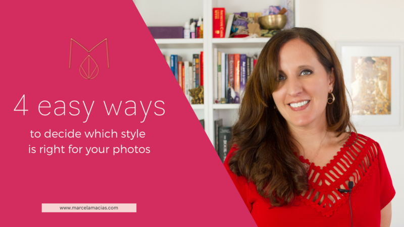
How to decide which style is right for your photos

How to decide which style is right for your photos
1


You want to have a consistent brand so you can be recognized the minute your photos pop in someone’s news feed.

But you just can’t decide what style is right for your brand.

How do you choose when there are so many possibilities?

In today’s video I’ll show you 4 ways you can use to choose TODAY  the right style for your brand- and make your brand instantly recognizable, without the headache.


Prefer to read? Here’s the transcript

You’re here because you’re one smart business lady, and smart business ladies make conscious decisions about every aspect of their business. Especially so when it comes to your branding- and your images are part of your branding.

So how do you choose a style that works well for you? A style that’s easy to differentiate and  with which you’re sufficiently comfortable with to be able to keep using it for years to come?


Here are 4 simple ways you can do so:

1) Color

The simplest way of all. Color is very memorable and produces instant reactions in our viewers. Colors increase brand recognition by 80%, which is why brands like Tiffanys have their own trademark pantone color.

Two famous entrepreneurs who have used colors brilliantly to be recognized are Bushra Azhar and Denise Duffield-Thomas.

Denise picked up Turquoise, her favorite color, and even though she re-branded and redesigned several times, she remained consistent in her colors. The tonality and shade of turquoise changed very subtly over the years, but the main color stayed. And, for those who know her, turquoise is DENISE.

Bushra chose by default her brand colors: they were the default colors of her wordpress theme, and orange is her favorite color. But she used them in everything: her website: the clothes she wore on her professional portraits, even decals she pasted on her wall to use as background for her videos. After a few months whenever people saw orange, they thought of Bushra. A fan even sent her a photo from Ikea, sitting on top of Bushra’s Orange circle rugs.

THAT is the power of color.

So how do you choose the right colors for you? You may begin by selected colors you love, but if you want the full science behind colors in branding, I recommend Brand Color Breakthrough by Karolina Chic.  Karolina is a color expert and in only two hours she can guide you to make the best decision.

https://colourbreakthrough.com/branding-join/


2) Seasons

I discovered this method when reading the books How to Style Your Brand and Brand Brilliance by Fionna Humberstone (both books I absolutely recommend).

This system takes the color system above to the next level. It is based on color psychology and uses the seasons in nature, and the emotions conveyed by them to create a cohesive look that transmits to your customers what you want to transmit.

The beauty of this system is that, with it, you won’t only know what colors to use, but also what type of photos are good  for you, what fonts correlate great with your brand season, what graphics fit your brand style and what effect all that will have on your customers.

Fionna has three  wonderful free resources in her blog to understand the seasons, including sample seasonal color palettes.  You can check them  out here:

They are:

The essentials of color psychology

Seasonal Personality color psychology worksheet:

Seasonal Color palettes

She also has a course on Color Psychology for Creatives, if you want to dig deeper into this method:

3) Astrology

Wait what?! Astrology?!

Yes, you heard correctly. This system is for the woos out there.

My client, Luisa Silva, from LuisaBazi.com uses Chinese Astrology, and the energetic patterns of your birth chart in order to see which colors, style and even content medium is better for you, which elements should be present in your photos and which ones shouldn’t,  and the best dates to start projects, launch products and overall do anything that matters.

4) Archetypes

My system of choice and the principal one I use with my clients. Why? Because it involves two of my passions: psychology, mythology and the world of symbols, and it’s the system used by big brands like Coca Cola.

This system is based on the work of psychologist Carl Jung, who believed (as I do) that there exists a collective unconscious, a series of symbols and meaning shared by all of humanity, and that within this collective unconscious, existed archetypes, which were universal images and patterns that define how we see, feel and approach the world around us.

In the 1960s, Jung Archetypes were translated into branding, and the main 12 branding archetypes were born. These define, not just the colors we use, but more importantly, our mission, our strengths and weaknesses and all our communication.

They define the ESSENCE of your brand – and its soul.

They make it relatable and understandable, because they tap into things we have intuitively known all our lives. They give it meaning , and, because of it, they  make it powerful.

And they do so because they relate to the fulfillment of 4 basic human desired and motivations:

Stability, Mastery, Independence and Belonging.

The 12 branding archetypes are:

The Innocent, The Explorer, The Sage yearn for – and promise- paradise and independence

The Magician, The Hero, The Outlaw, look to leave their mark in the world through self mastery

The Lover, the Regular Guy and the Jester look for and promise belonging.

The Caregiver, The Creator and the Ruler searched for and provide stability.

You have seen them at work in the powerful tales of our time.

The Hero lives in Luke Skywalker’s journey to free the galaxy from the Oppressive Empire and in Frodo’s quest to destroy the One Ring. It lives in Rey, whose innate command of The Force and her big heart and love for her friends, sets her on her own heroine journey.

The Magician lives in Yoda, and Merlin who guide Hero and Ruler to discover their power- starting from within.  

The Ruler lives in King Arthur who unified the tribes and provided stability to the Kingdom. It lives

Now come closer, because I have a gift for you.

A 5 minute quiz that will help you discover your main branding archetype and start harnessing its power. And it’s free 

You can take it going to marcelamacias.com/quiz 

When I found my archetypes (The Magician and The Innocent) it was like finding the key to my soul. Go take the quiz, and then come back and tell which are yours!

If you liked this video and want more like it, subscribe to my channel and share it with your friends. Remember to download the checklist of questions that comes with this post on the link below, so you can go through all this before your next photo shoot.

Have a lovely day and I’ll see you soon with more videos to help you grow your business beyond your wildest dreams
PINK M

DISCOVER THE SOUL OF YOUR BRAND

Take the quiz to find your Branding Archetype


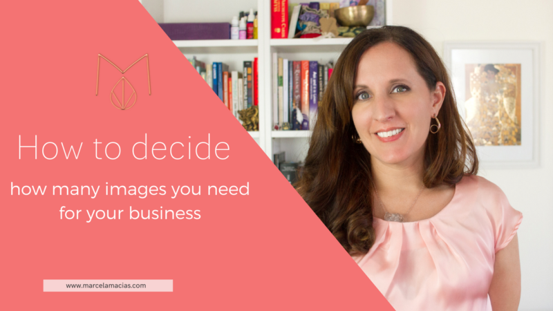
How to know exactly how many photos your brand needs

How to know exactly how many photos your brand needs

How to decide which image you need 11

You’re about to plan a photo shoot,  and are ready to call a photographer o get your first brand photos. Or maybe you’ve set your eyes on a premium stock collection.

But will the photos you have asked be enough?

What should you ask your photographer to photograph?

How many photos will you need before you need a  new shoot or a new purchase?

How can you make sure you’re maximizing your investment, and won’t end up wishing you had asked for something different a month from now?

In today’s  video I’ll show you the system I use with my photography clients to make sure all their image needs are met- for at least a year.

Prefer to read? Here’s the transcript:


Images follow words, my friends. And they follow your projects, your goals and your business objectives.

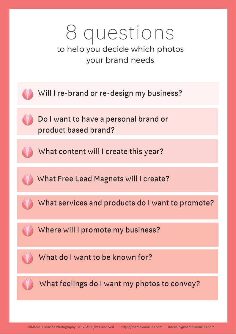
In order to determine which photos you will need, here are the questions you need to ask yourself:


  1. Will I change my website? Re-brand? Upgrade my design? Create a video intro?


You need to know this in order to make sure that all your design needs are met. If you will be doing a major re-brand or re design, it’s a good idea to work with designer, brand stylist and photographer as a team, so each has the same vibe and feel.

Your design and branding, including branding collaterals and other printable material will also determine the size and resolution you will need, as well as the type of photos you require. As a minimum, you will need:

  • A great photo for your Header.
  • A great portrait for your about page
  • A variation of photos that you could use in your blog and to further illustrate other pages.


2. Am I at the center or my brand, or are my products? Do I  want to shift this?

Personal Brands are all the rage these days, but they’re not everybody’s piece of cake, or great for every business.

It is up to you to make your business based on YOU, to be the face of your business, or to make it more product/service based. I recently had a client, for example, who hired me because she was tired of having her face plastered everywhere on her site. She wanted to put the accent on her clients and what she could do for them instead. So we created a series of images with lifestyle scenes and flat lays showing her products and representing her services, and how her clients could use them. We photographed the printable worksheets of her lead magnet and those of her main offering, and created images with electronics where she could overlay blog posts, videos and other material, to keep her images up to date.  

3. What content will I create this year?

What topics will you write about? Where will you focus? How many blog posts, videos, social media posts are you planning to put out into the world?

The most effective photos speak the same language as your copy. So plan what you will be speaking about, so that you can find or commission photos that show the same topics and elicit the same feelings.

4. What free lead magnets will I create this year?

Again, think about topics, feelings and lifestyle, as well as practical issues such as design, and layout.

5. Which services do I want to promote? Has anything changed about my services that I want reflected in my photos?

Do you want to promote one to one services? Group programs? Live seminars? A conference? The type of photos you’ll need for each of these are different. If we want to convey personalized, one to one services, a photo of you leaning towards the viewer would be great, as would photos of hands in front of the computer, or working on your worksheets…whereas for group programs, seminars and conferences we would also need to convey the idea of community.

Same with your services. A change in the type and range of services you offer may require a re-evaluation of the photos used to represent the lifestyle and convey the feelings you want to elicit in your potential customers.


6. Which products will I be launching this year? With which frequency? Do these products have photos or do I need to take new updated ones? Are there new products? What is important for people to know at first glance about my products that I want the photos to reflect?

Knowing what you will be launching and when will allow you to make sure that you always have photos for your sales pages, social media and ads and that these images match the feeling of the products you’ll be launching.

And don’t worry if you haven’t finished creating those products. If you have an idea of what they will be about, and who they will target, I can photos photos for them.

Here’s how I did it with one of my clients, Andrea Hiltbrunner. We took a look at Andrea’s huge range of products, and her brand colors, and grouped them according to the chakra they helped activate. For example, some products helped her clients access their intuition, so we chose the colors of the third eye chakra, some products helped her customers feel empowered and make money, so we used to colors of the first and third chakra (red and gold). We divided products in the same way, using archetypal symbols.

For some core online products that were ready to be launched, we printed their worksheets, but for those that were still in development, we focused on the feeling we wanted to portray, where they landed in our chakra color chart, and used electronics and blank pages where Andrea’s designer could later overlay the worksheets and video snapshots of her course.

If you are planning to create a different range of products, talk to your photographer about them so she can shoot images you can later use to illustrate them, and don’t need to run around stock sites looking for extra images.

7. Where do I promote my business? Will I be adding new channels?

Which social media platform do you use? Which one gets you the most and best clients? Are you planning to add a new social media platform or simply deepen and grow your presence in the one you’re already mastering. How many times a day do I post on each?
Do you also advertise? Where? Facebook ads? Google ads? Blogs? Print media?

This is important for three reasons:

a- First, because you will need photos that can look great in the sizes and resolutions of each medium,

b- Second, because each social media platform has different audiences and what works in one, may not work in the other. Instagram audiences, for example, prefer more curated feeds, whereas “realness” and humor work very well on facebook.

c- Third, because the number of posts and the sizes you require will determine how many times you can repurpose a photo with crops, and color overlays.  One of my flat lays can be cropped into 30 different square images. With color blocks in two different brand colors and two different shapes,each image can shield 150 instagram posts. If you consider that with my Grow Plan, you get 15 high resolution images and 30 tutorials on how to repurpose your images,  what you are actually getting are  2250 social media posts, which allows you to post 6 times a day for a full year on social media, and not repeat visuals. Or 3 times a day for two years. Without counting photos you make take with your phone, or portraits or even graphics.

15 photos, then,  are not 15 photos. Well planned, they’re two years of peace of mind.


8- What do I want my clients to know about me?


The answer to this question will determine the type of photos we take. Whether we focus more on lifestyle images, corporate style ones, or on your products.


Here’s what you need to do: Choose 5 qualities you want to convey with your photos. The ones that make you different from others in your same field. Give these words to your photographer or use them as keywords during stock photography search.

9- What feelings do I want to convey with my photos?

What do you want your future customers and your fans to FEEL when they see your images? What do you want them to think?

Joy?

Relief?

Peace and Calm?

Intellectual stimulation?

Inspiration?

Creativity?


Choose 3 core desired feelings that you want your brand to convey and list them down.


Now let’s put all this together.

Let’s say in the next year you will:

Redesign your website

Start vlogging

Launch, twice,  2 existing products which have outdated photos (one is coaching/mentorship, the other is a group program at a medium price range)

Create a new product (a high end retreat or a conference/ a high priced group program)

You have 5 different lead magnets that use a combination of printables and video.

You will publish 52 blog posts, of which half will be video.

You want to show: leadership, excellence, approachability, spirituality, warmth

You want people to feel relaxed, empowered, and joyful when they see your photos.

You will post on instagram and facebook 3 times a day. You will also start using linkedin and need images for your youtube video thumbnails. You will promote using facebook and linkedin ads, and want photos that are printable because you are looking to get featured in the printed press.

Here’s how this translates into images:

You will need,at a minimum:

  • 3 o 5 different portraits. You will want a portrait for your about page and social media profile photos (make it the same), and a variety of other photos for other parts of your website (eg, contact page), and for media publications, as well as social media. These should include a photo of you leaning forward to represent listening to a coaching client, and a photo of you speaking on stage (to promote a retreat, or conference)


  • 5 different portrait orientation product/lifestyle photos that you can use for your lead magnets, social media and website illustration.


  • 10 flat lays that you can use for your website, and that you can crop for social media and to promote your content. 10×150=1150 /365= 4 photos a day. The Flat Lays will show  your different products (2 with the style of each of your products, and 4 in the general style of your brand, more towards the higher end style, with electronics, . They can also act as Header and floating backgrounds for your website.


  • Ideally, you would also add 3 to 10 lifestyle photos showing groups of people working together, listening (to you speaking) and detail shots of beautiful objects included in your brand (such as brand collaterals, gift packages etc, if you have a fully designed brand. If you don’t, you don’t need this).


  • GRAND TOTAL: 15 -25 product, flat lay & lifestyle images, + 5 portraits. 20 to 30 high quality, personalized, high resolution images can solve all your photography needs for a full year.


You can always add more images, and I would absolutely recommend getting professional retreat  or conference photos, as well as professional book photos, if you’re a published author. You can also, depending on your budget, shoot individual collections for each product. But with 20 to 30 great images, you are set. All the rest is the cherry on top.


If you liked this video and want more like it, subscribe to my channel and share it with your friends. Remember to download the checklist of questions that comes with this post on the link below, so you can go through all this before your next photoshoot.


If you’d like to work with me, book a free call over at marcelamacias.com/book-now so we discuss what all your needs.


Have a lovely day and I’ll see you soon with more videos to help you grow your business beyond your wildest dreams
 

10 cool apps to create visual content on the go

PINK M

Want photos that look like you- and no one else?

Click here to book a call so we can discuss your needs 


8 Mistakes you should avoid when creating a Flat Lay

8 Mistakes you should avoid when creating a Flat Lay

Copy of creative process


Have you ever started creating a flat lay for your business, only to discover that you can’t manage to make them look like you had in mind- but you don’t really know what you’re doing wrong?

Today is your lucky day, because in today’s video I will show you the mistakes you need to avoid when creating a flat lay for your business- and what to do instead.


Check Margalida’s video here: https://www.youtube.com/watch?v=uqr1HrAj-FA


Prefer to read? Here’s the transcript:

This video is a collaboration with landscape architect Margalida Nadal, who will show you how to arrange flowers in a flat lay so they look their very best.  Margalida has an amazing youtube channel with plenty of tips for your garden – so if you speak Spanish, go check it out after this video.

Let’s begin!

So, what is a flat lay? A flat lay is a photo of a desk or any collection of objects taken with a bird’s eye view- or in other words, from above. Flat, because that’s how all objects look from that view (there’s nothing tri-dimensional  no objects out of focus, no background other than the one where the objects lay. They’re very popular on Instagram because they’re relatively easy to take with a phone camera and you don’t need funny lenses to do so.

They look easy- but if you’ve tried to take one yourself you may have realized they’re not so much so. So, to help you out, I’ve compiled the most common mistakes I’ve seen online-so you can avoid them, and simple easy solutions you can put in practice today.


Mistake Number 1: You don’t have a strategy behind your flat lay

This is the number one mistake most people make. Having a strategy means: you know in advance where you want people’s eye to go, what you want them to focus on, what feeling you want to provoke in them when they see your photo and how and where you will be using the photo.

You are a smart ladyboss, you make sure you know this before you begin:

  1. What do you want to showcase: A product? Lifestyle? Some object you want people to identify with you.
  2. What feeling do you want to evoke: Fun? Ease? Aspiration? Comfort? Cozyness? Joy?
  3. How will you use the image ? Will you add text? Will you crop it in several different images? Will you overlay blocks of color?
  4. What objects that you have around your house speak about you, about who you are, about your values, about what matters to you? Could you add these to your photos?


Taking a few minutes to answer these questions will help you create faster and with ease photos that enchant your customers and grow your business.


Mistake Number 2: You don’t have a clear focal point or you’re not using it correctly.

The biggest mistake. This is when it’s not clear in the photo what you should focus on, or the most important objects are away from the places where the eye is naturally drawn.

You need to decide what you want people to notice FIRST when they see your photo, and place that object in the right place for that to happen.

What’s the right place? Here are a few examples:

Center: The easier one, where the rest of the objects frame the object in question and direct the eye to it. 

Rule of thirds: draw two horizontal lines and two vertical imaginary lines in your background and place important objects in the intersection between two lines. Movies and series do this all the time (show framing of Outlander). 

ONE NOTE: If you are creating a flat lay with negative or white space where you are planning to add text, consider text your focal point and style accordingly.


Mistake Number 3: There are too many objects distracting from the focal point

I love props. I adore them. Scouting them, buying them, styling with them. But the key with props is to use them STRATEGICALLY, to direct the view and to say things that you can’t say with words. Objects denote luxury, coziness, spirituality, fun, child-like joy, or your heritage..and pretty much anything you want to say, and, as such, are powerful assistants.

But when they clutter the image, they detract from your focal point (and remember, the focal point is what brings sales!) . Cluttered images are overwhelming…and an overwhelmed person won’t buy.

Allow the eyes to rest….and when in doubt, remove until what stays feels  just right.


Mistake Number 4: The lines in your flat lay take the eye away from your focal point

Remember those foam hands with pointed fingers that were everywhere in 50’s adds? Or those images of a woman pointing at text?

The objects in your flat lay need to act like those fingers, they need to be like arrows pointing at your focal point.

So here’s what you need to do:

1) Take a look at the shape of the objects you’re planning to include in your flat lay and make sure that they’re directing the eye where you want them to. Example: pen, post its, erasers, spoons.

2): Use hands to draw attention to the most important objects by holding them or framing them


Mistake Number 5: The composition is not balanced

You either have too many objects on one side or none at all. Remember: The Human eye likes symmetry, so unless you’re creating a flat lat to act as a frame or partial border, make sure there’s balance in the number, position and height of your objects…

Which brings me to the next point…


Mistake Number 6: Some objects are out of focus

In a flat lay all objects should look crisp and sharp. You should be able to quickly visualize everything in them- which is why they’re so great to photograph with your phone camera

But in order for all objects to be in focus, you need to take care of two very important things:

1) Have the right camera settings. If you’re shooting with a DSLR, make that your aperture is higher than 4. I shoot flat lays at 7 or above (depending on the lens, the sharpest aperture varies). Lower numbers are great for close ups because they blur the background, but terrible for flat lays.

 2) Make sure that all objects have similar heights.

Want to use flowers in your flat lay? Trim them! I cut the stems super tiny and put mine in a small glass of water (the tiny ones from Ikea). And always, always, always, set the focus on the most important object (your focal point).


Mistake Number 7: Whites are not white

This is the trickiest one, especially if you shoot with natural light, from a window that doesn’t reach the floor. Have you ever seen flat lays where objects that were supposed to be white look yellowish or blue?

This problem is called white balance. Some times, it’s easy to fix, sometimes it’s not.

Here’s what to do:

  1. Adjust white balance in your camera, and use custom white balance. The way this works is you shoot something very white first, so the camera can understand what constitutes pure white and adjusts automatically the color afterwards.
  2. Adjust white balance in post production. I correct minor color problems in camera raw, for example
  3. If all the above sound too complicated…choose backgrounds in another color. I promise you, there will be much less to adjust and you can add some personality to your flat lays.

Greys, blues, wood and pink and great options. Look at your brand colors and choose backgrounds that will make your products pop!


Number 8: Your flat lay lacks personality- or has a personality other than your own


You are a business woman, and as such, your flat lays (and all your photos) should promote your business and help you sell. The way to do this is for each and everyone of your photos to contribute to telling your brand story.

They should showcase your brand personality, remind people of who you are, start conversations.

Lots of people fall into the trap of the “luxe lifestyle” photo and end up choosing images that have nothing to do with them, their message or their target audience and end up alienating prospective buyers.

When you choose stock images or create your own, make sure your best friend would recognize YOU in them.

Think:

what do you talk about in your blog and social media posts?

What objects remind you of defining moments in your life and career?

What objects could act as anchors of your message and your personality?

What objects reproduce the shape of your logo?


Got it?


These were the mistakes you need to avoid when creating a flat lay and what to do instead.

If you liked this video, subscribe to my email list below because many more are coming!

See you soon, with more videos to help your business grow beyond your wildest dream

PINK M

Want photos that look like you- and no one else?

Click here to book a call so we can discuss your needs 


How I create [Calling the Muse]

How I create [Calling the Muse]

How I create

Have you ever wondered how people do what they do? How bakers create their cakes, how designers come up with gorgeous logos, how photographers photograph? And no, I don’t mean backstage footage or photos (which is also fascinating).

I mean what comes before: the process that leads to an idea being born.

The rituals that help us conjure the inspiration, call in the Muse.

Copy of Copy of Quote template 2


I’ve shown backstage videos and photos of my work and I’ve created step by step tutorials many times too. But I’ve never talked openly about the process that leads to my photos being a certain way.

A part of it is science: I know about color theory, design principles and I know my camera well enough to make it do what I want it to do.

But the crucial part, I must confess,  is magic.

Not the magic of card tricks or flying wizards, I haven’t joined Howgarts yet (the damn owl refuses to bring me a letter).

The magic of calling in and opening myself to the creative energy and allowing it to show me the way.

I have a series of rituals that help me be in the right mood for creating, and today I wanted to share with you one of them: Creating my amulet mixed art painting.

I learnt this process from Jo Klima‘s beautiful course AMULET and it has been a fantastic way to let go of blank photo card paralysis (like white page paralysis, but for photographers). And since then, whenever the fear of starting a new project settles in, I know I can exorcise it with a bit of paint.

The process is simple, and highly intuitive and it seeks to create an anchor, a reminder of our intention. To declare our openness to divine inspiration and divine guidance. To call in the energies we want to play with, intentionally and consciously.

It’s not about knowing how to begin a project, it’s about feeling our way into it, one brush stroke at a time- which is why it works so beautifully. It shuts down the mind, and opens the heart.

It starts with a paint and paper and dirty hands…

Blog Post 0

It continues with glue, and glitter, mantra music and marker pens…

Blog post 1

And by the time I’m done, resistance is gone and taking the next steps of a new project are easier, because it feels like I’ve already begun. 

Blog Post final

The painting above marked the beginning of a project I’ve been dreaming about for some time and that I’ll be birthing into the world in the next few weeks.

I used red, orange and turquoise to call in creativity, passion and free-flowing communication. I called in the energy of Goddess Fortuna, so it’ll prosper and the help of the dragonfly, to connect me with the best ideas within me. I called on the Earth to anchor this project into reality, Fire, to bring it to completion, and the Moon, to imbue it with divine feminine essence. I called on Mars for strength and courage and Jupiter for blessings.

I saged the room before beginning, lit a candle to illuminate the way, and played one of my favorite mantras while I painted.

I’ll tell you more about this project and the rest of my creativity conjuring rituals in my next blog posts.

And now, let me know: how do you create? 


PINK M

Want photos that look like you- and no one else?

Click here to book a call so we can discuss your needs 

How to create GIFs in just a few easy clicks

How to create GIFs in just a few easy clicks

How to create Gifs with your photos
Have you ever scrolled down social media and seen one of those funny photos with moving parts or text and wondered how they’re created?

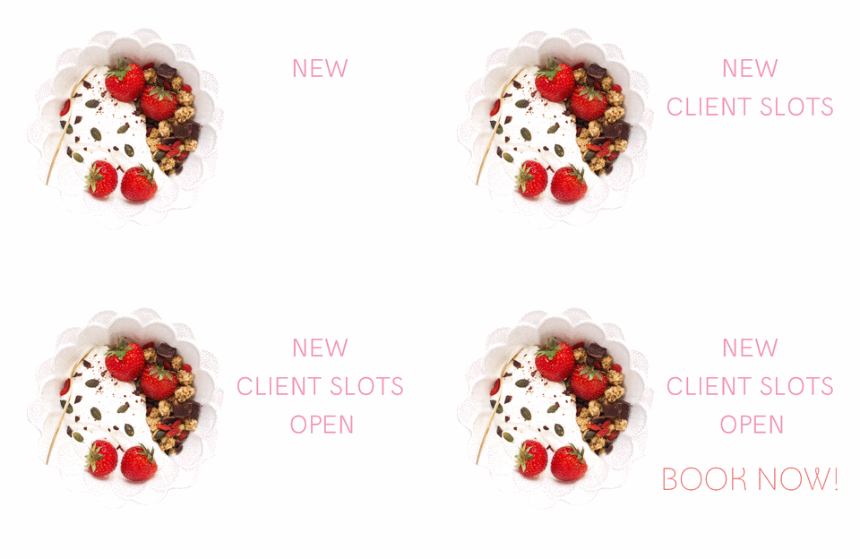
Have you ever wished you could create images like the the one below,  with animated parts that catch your attention the minute they appear on your news feed?


giphy

In today’s blog post I tell you why you may want to create gifs for your promotions (they’re catchy! they attract attention easily! they’re fun!) and, more importantly, I’ll show you step by step, how to create them. It’s fast and easy, I promise.

And the best part? I’ll show you how to create them with and without Photoshop, so there are no excuses.

Ready to get started? Click play to learn how to do it.


And if you’re wondering how you can use Gifs in your marketing, here are some ideas:

  • Create announcements (like the one I created above)
  • Advertise promotions
  • Show product variations (for example, different colors of a t-shirt)
  • Show different products, like a mini portfolio
  • Show all products included in a bundle
  • Show step by step photos of a DIY or tutorial
  • Show different steps of recipe making
  • Show what makes your service special (example: everything you include in your packages when wrapping your product and how it looks when finished).

The possibilities are endless- let your imagination fly!


Now it’s your turn! Tell me in the comments below what gifs are you planning to create first.

And if you liked this video, please share it!


WANT MORE VIDEOS LIKE THESE?

Make your photos work for you READ ME

I created a series of video tutorials to help you maximize the power of your marketing images. If you have run out of ideas on how to promote your business with photos, or lack the technical know how on how to implement some of them, this course is for you!

Check the full list of videos (23 in total!) in the link below and start using your photos to their full potential!

By continuing to use the site, you agree to the use of cookies. more information

The cookie settings on this website are set to "allow cookies" to give you the best browsing experience possible. If you continue to use this website without changing your cookie settings or you click "Accept" below then you are consenting to this.

Close