How to make your visual content engaging: the strategy of empathy

One of the biggest misunderstandings about visuals and marketing that I see very often is the belief that high resolution photos will instantly equate more engaged fans, higher sales and a perception of professionalism that will allow us to charge higher rates.
Let me give it to you straight right now: It’s just not that simple.
If it was, with so many sites where you can get good quality photos for free or for a minimum price, everyone would have a cult following and a thriving business.
We would all get a drag and drop theme for our website, find a free high quality image to use as Header, or purchase one, and bibiddy babiddy boop, we would have hoards of followers waiting for us to produce our first product, which we would, of course,sell out in 5 minutes maximum.
If it was only a matter of pixels and dpi, everyone with a DSLR camera… or even an iphone, would be rich and famous.
And we all know that it doesn’t work like that.
So what works, you may be asking yourself?
What is the magic trick that will make your visual content engaging, helping you generate the all mighty tribe of 1000 true fans and followers that will, in turn, purchase everything you release?
What makes a photo effective when it comes to marketing, and what makes it just another one of the pile that we never even notice?
How can you use visual content in an engaging, effective and strategic way?
That, my friends, is what I set out to discover last year, as I mentioned in this previous blog post, and what I want to talk to you about today.
I’ve said before that I wholeheartedly believe that the key to effective marketing and effective visuals is caring for everyone that comes into contact with our businesses.
Truly, deeply caring about them, even if they don’t buy, even if they just read our social media posts and don’t sign up to be a member of our communities. Caring for the work we do, and caring about the effect it has in our followers and customers.
What does this have to do with visuals?
Everything.
Visual content is a form of communication. We either use it as a way to scream from the top of our lungs how awesome we are (even if no one listens) or we use it to start conversations, to connect, to tell stories.
[Tweet ” We can use visual content to scream our greatness with no one listening or to start conversations.”]
Visuals, when used right, are a conversation starter.
When it comes to words, we all know that in order to start meaningful conversations, and communicate effectively we need to listen, to observe, and to be aware of other people’s feelings. Visuals are no different.
Let me explain. Some people believe that their visuals are supposed to be about them: what they like or don’t, what their life looks like, their aspirations and dreams. Others believe visuals are supposed to be all about their customers, regardless of what they like or don’t like, and regardless of whether what they post fits their personality or not. Both positions have some truth in them, but both forget something important.
If your visuals don’t appeal to your customers, they won’t connect and they won’t buy. If your visuals have nothing of you in them, they will sound off and fake and sooner or later, you’ll lose face.
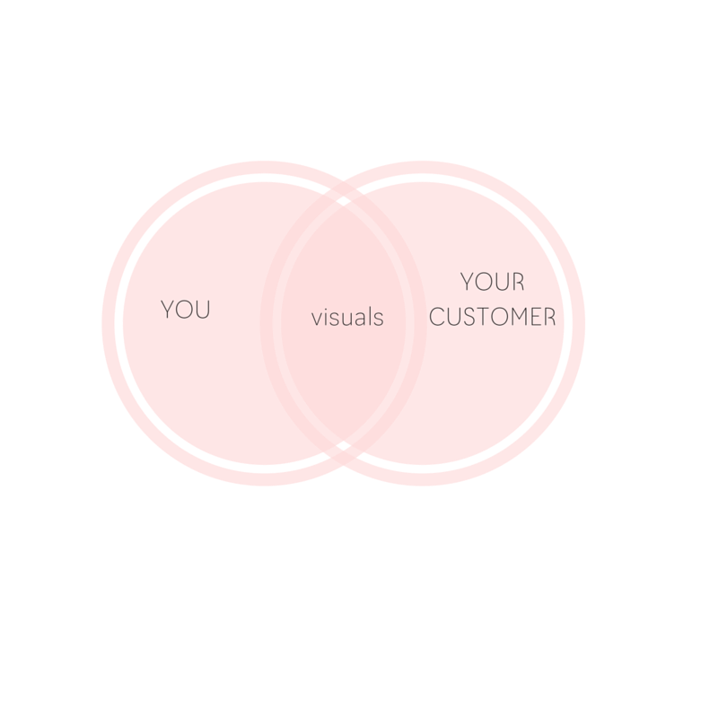
Successful visual content lies at the intersection of who you are and what your customers like and need from you.

Your visuals need to have your personality, reinforce your positioning and contain elements that your followers already identify with you, in order to anchor these in their mind. They need to look like you in order to be authentic.
This is why, when I start working with someone, I read all the copy from their website and their blog posts. This is why I their social media, paying special attention to the posts that get more engagement and how they are already connecting to their customers. This is why I ask my clients to take a series of branding personality tests and to fill a questionnaire I’ve especially designed for them.
The props I choose in a photo are directly aimed at generating an instant connection in the mind of my client’s customers that makes them recognize her photos and anchors the right elements of her personality and her brand in their mind.
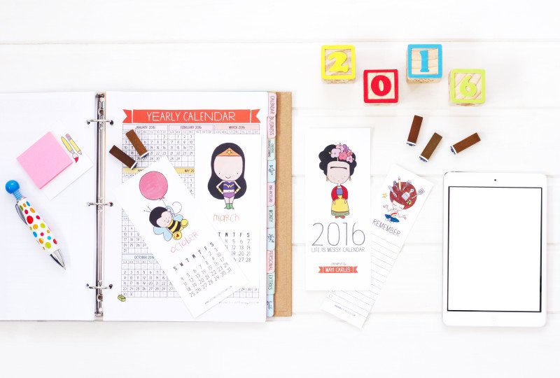
This is why I use cubes to spell the current year when shooting Mayi Carles printable planners, because I know one of the key elements of her video backgrounds are cubes with her name, and that her followers associate cubes with her.

This is why I make sure that the colors, backgrounds and style of my client’s photos match what people already know and love about them.
And your visuals need to consider your clients as well, so they can connect to you on a deeper level. And this is a matter of observation, empathy and care.
If you want people to engage with your visuals, make sure you’re creating them with your clients in mind.
[Tweet “If you want people to engage with your visuals, create them with your clients in mind.”]
Here are a few ideas on how to do this:
- Always post what is authentic to you. Drop the fear of not “looking premium” or “professional enough”. You are who you are and who you are is enough. Be proud of what you have to give and the story that brought you where you are. You don’t need macarons on a golden desk if you’d rather eat a chocolate chip cookie on a beach-side wooden tablen with your toes in the sand and a mason jar with lemonade and a paper straw in your right hand
- Take an interest in those who follow you. Visit their profiles, engage with them from the heart. Engage first, from a place of true interest, honesty and caring.
- Observe and listen actively: what do they like? What do they share? What do they connect more to? What photos drive more engagement? What photos drive more sales? What aspects of your personality and your brand resonate more with your customers? What do you share with them in terms of likes, values, dreams and aspirations?m (hint: I observe reality on instagram and facebook and aspiration on pinterest. Sometimes they match, sometimes they don’t and that’s very interesting).
- When something works, do more of it. For example, the pen that you see in the photo of Mayi’s printables above, that looks like Gru‘s spaceship with polka dots, is always a hit. Whenever Mayi posts a photo with the pen in it, she gets comments about it. The reason I originally chose it was that 1) Mayi was pregnant and I wanted a more child like fun prop in her photos (before we had been using one with Florentine design because Mayi studied art in Florence). 2) The shape looked like a rocket, and we were introducing it for a launch 3) Its polka dots colors are present in Mayi’s printables. When it became a hit, we continued using it and now it’s a prop I only use for her photos because it has become part of her brand. (side note: I totally took it from Zoe’s pencil case but let’s keep it between you and me, ok? 😉
- Put yourself in your buyer’s shoes. Remember why you’re doing this, who you help and how. Remember that people have different tastes and there’s not a single definition of beauty. Consider the emotional impact what you post can have in your ideal customers.
One example about this: I was once working to define the styling of a client who had been using, until hiring me, very luxurious looking stock photos. I asked her how those photos had been doing and she mentioned that not well at all. She was puzzled. The photos were gorgeous but they were getting 1/3 of the engagement than her more ” real” ones. And she couldn’t figure out why.
Here’s the thing: For some people, luxury is enticing and they like to browse aspirational sites to day dream of how they will one day live, when they have that kind of money. For others, though, luxury is a trigger that reminds them how far away from that they are, and instead of provoking enthusiasm, it depresses them.
You need to be aware about this differences in perception when planning your content, if you want your visuals to help you grow your business. You need to know who your ideal clients are, what they’re going through and what they need from you to craft visuals that help you grow your business.
And the only way to do this is by testing, observing, listening and caring.
Now let me know in the comments below: how do you plan your visuals? What type of visuals get more engagement from your audience?

Trackbacks/Pingbacks